COLOUR MIXING
There are at least 3 different approaches to colour mixing that could be considered –Theoretical, Aesthetical and Practical. There is already a huge acreage of information about colour theory, so I will pass over those aspects. The aesthetic choices about how colours and tones influence each other within a given painting are something that you will begin to feel for yourself, provided you do the practical work. As somebody pointed out to me: athletes and musicians do a lot of practice before performing, but artists often expect to get everything perfected without practicing.
What I am setting out to do is to stay in the practical zone, and give you some colour mixing exercises. You will find as you go along that you will get the colours you want by experience once you have acquired the necessary background, and you will also have for your reference a wall chart that you will create for yourself if you take part in this project.
My aim is that you will get the experience to recreate any colour you want by practicing mixing colours, and eventually you will learn to “see the colour within the colour,” which is a term I use to describe being able to visually analyse what you are looking at and be able to create the necessary mixture. For instance, if you want to paint foliage you may decide to start with Pthalo Green which is a very unnatural looking colour. However, if you neutralize the unnatural look of the Pthalo Green by adding Burnt Sienna, you will end up having a more useful mixture that you can then rectify by adding white or black, depending on the tone you want to achieve.
This is a very non-theoretical process, one that requires practice to end up feeling the “colour within the colour," but it becomes very satisfying when you learn how to do it for yourself.
THE ILLUSION OF PAINTINGS
Nowadays you can go to any art store and find an incredibly large array of colours, however some few centuries ago at the time of Rembrandt that was not the case. For instance, gold was not a colour you could just get by going to your local “paint store" but as you can see Rembrandt was able to achieve the illusion of a golden helmet by using primarily two colours, Yellow Ochre and Burnt Sienna and adjusting the tone. You could read a hundred books on colour theory and buy every colour available in your local art store, but without practicing you will never develop the necessary skills to create your own illusions.
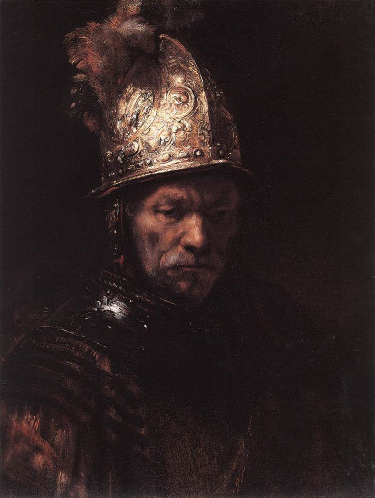
Rembrandt van Rijn, The Man With The Golden Helmet, circa 1650
A LIMITED COLOUR PALETTE
It is a good idea if you are new to painting and you want to start mixing your own colours to limit your colour palette, because is easy to get confused by the enormous array of colours available in the art stores right now. With a reduced array of colours you can devote your time and energy to understanding how they work together.
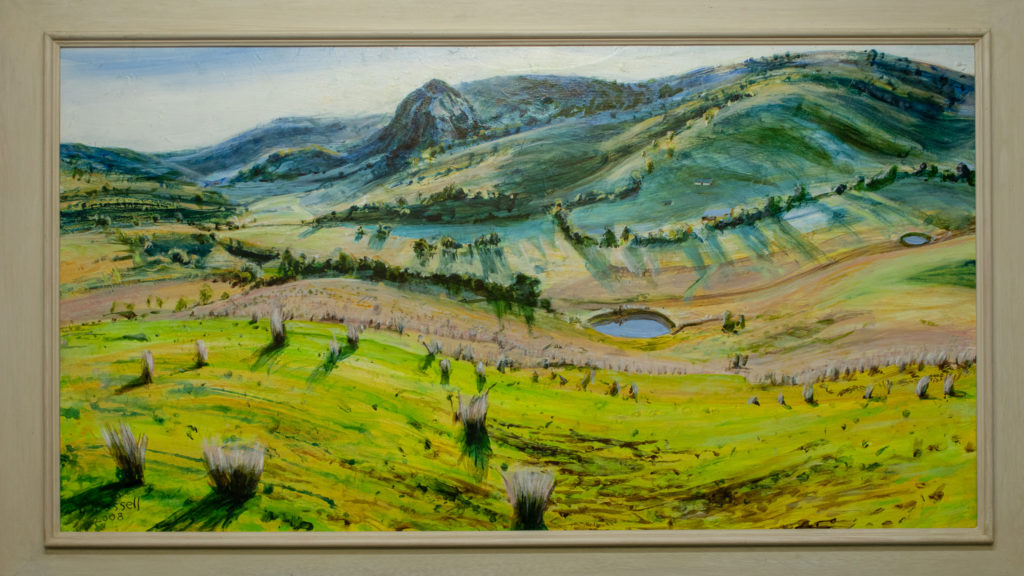
Chris Fussell, Murrurundi Sunrise, Atelier Interactive Acrylic on board, 2008
This colourful painting by Chris Fussell was made using very few Atelier Interactive Acrylic colours - not more than 10 - however the tonal work achieves the illusion of a large open space. For example, for the acid green colours Chris used Permanent Green Light with a hint of Titanium White. For the middle ground greens, he used Permanent Green Light mixed with Arylamide Yellow Deep and Titanium White. The foreground is Raw Umber and Paynes Grey, with a lighter top section made with Raw Umber and Titanium White.
Share Your Artwork With Us
It can look very selfish and egotistical for me to be filling cyberspace with paintings that I have done myself, but I would like this website to become one where people can share their images and experiences. I am not a very digital person but I am told that is not difficult to send an image from your iPhone to our email: marketing@chromaonline.com. We would love to share your images on our different social media networks in order to create a community of artists.

![]()