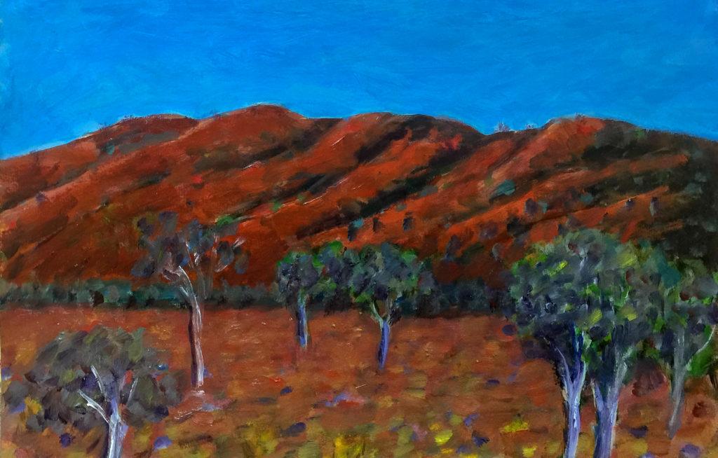
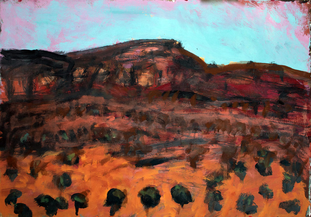
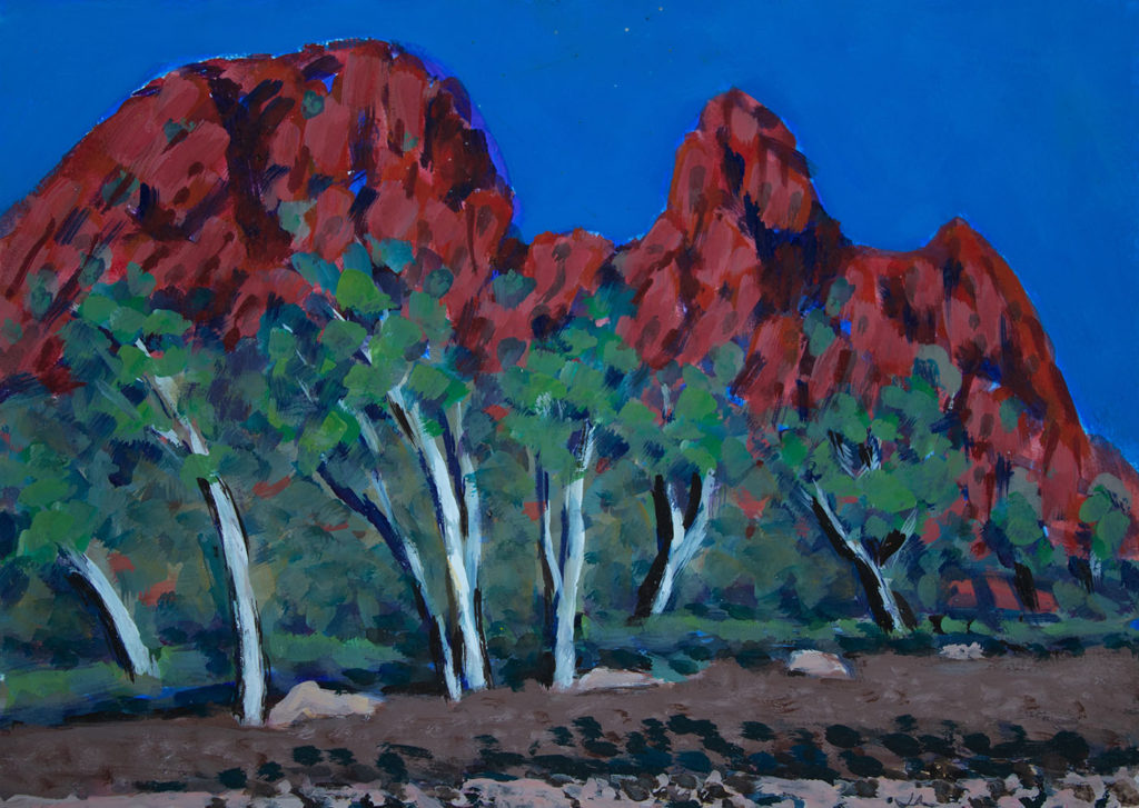
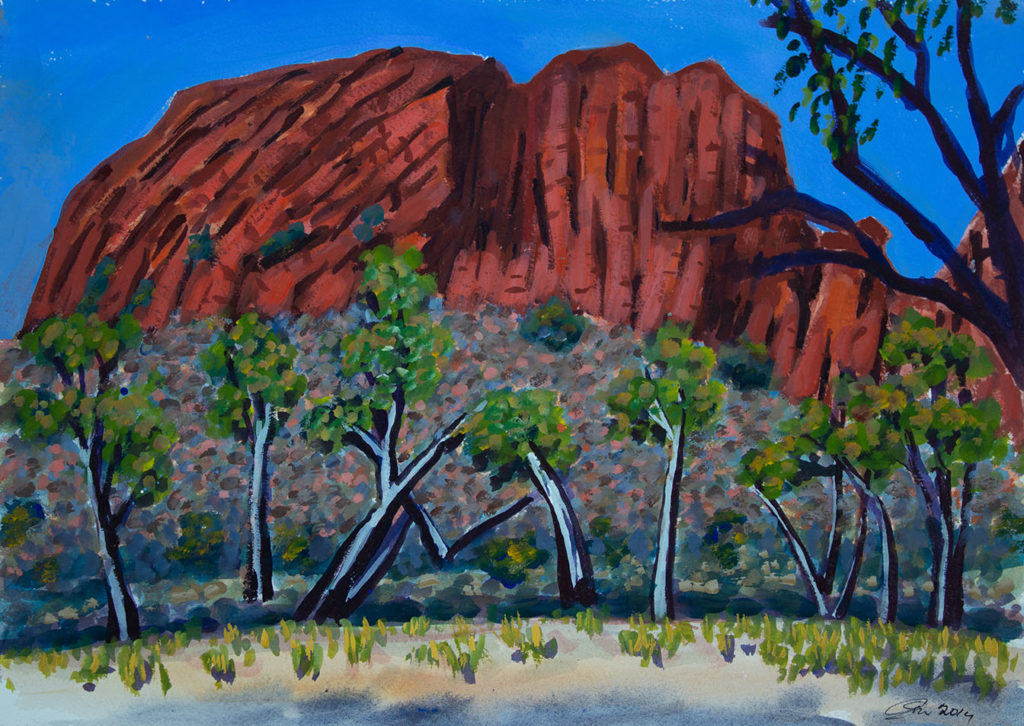
THE AUSTRALIAN OUTBACK
To landscape painters the Australian Desert has an almost hypnotic appeal that drags you to come back time after time in the pursuit of capturing those characteristic colours that just the Australian Outback can offer, rocks of subdued orange below a bright blue sky, with patches of green bushes that contrast against the reddish ground of the desert.
To me, landscape painting has less to do with reproducing reality than evoking the feeling of the landscape itself. And to evoke the feeling of the landscape, you will need to intuitively see the colour inside the colour, which is the term I use to describe being able to visually analyze what you are looking at and being able to create the necessary mixtures.
If you are new to colour mixing you may look on colour mixing as a cooking recipe that you follow to get a specific colour. Although this might be true, in my personal opinion such a structured approach will lead you to disregard the importance of your own composition and how colours behave next to each other, because the endpoint is not to copy reality but to create the illusion of reality.
I wrote an article about the importance of tonal value and the illusion of reality if you want to read it.
AN INTUITIVE APPROACH TO COLOUR MIXING
My idea is not to tell you how to precisely get a specific colour, but to show you what colour mixtures I use when I want to get the feeling of the Australian Outback. If you carry out your own colour mixing exercises, you will undoubtedly develop a certain sensibility to adjust your colour mixtures as needed. This sensibility is what I refer to as seeing the colour inside the colour, which is a more intuitive approach but delivers a more organic look to your painting.
Eventually you will be adjusting the tone, brightness and hue of your colour mixtures without even noticing, freeing your attention and energy to other areas of the painting process. such as building the composition and creating the feeling you want to evoke with your painting.
COLOUR MIXING - SHADES OF RED
For these exercises we will be working with Quinacridone Magenta and Napthol Red Light and mixing with Burnt Sienna, Burnt Umber and Titanium White in order to get an array of colour mixtures that can be used for landscapes. More importantly, you will end up developing an eye to know when your colour mixture is right where you want it to be.
Share Your Artwork With Us
It can look very selfish and egotistical for me to be filling cyberspace with paintings that I have done myself, but I would like this website to become one where people can share their images and experiences. I am not a very digital person but I am told that is not difficult to send an image from your iPhone to our email: marketing@chromaonline.com. We would love to share your images on our different social media networks in order to create a community of artists.

![]()