The colors found in the Atelier Interactive Professional Artists’ Acrylics and Archival Oils paint lines are classified as opaque, semi-transparent or transparent. You may wonder just what opaque, semi-transparent or transparent mean, and why should I care? It’s important to understand what these characteristics of the color are, because how opaque or transparent a color is plays a big part in getting certain effects. And because Atelier Interactive and Archival Oils paints offer more paint in the tube than leading national acrylic or oil brands, you have more paint with which to explore new techniques.
What we see as color, are actually different wavelengths of light. Pigments are what give paint its color, and they absorb and reflect different wavelengths at varying degrees. Pigments also can be varying degrees of opacity. In simplest terms, an opaque color is one that you cannot see through, a transparent color is one that you can see through, and a semi-transparent color is one that you can sort of see through. Chroma makes it easy to tell if a color is classified as opaque, semi-transparent or opaque – just look at the tube, a color chart or the jar! If you see a circle that is filled in, it is opaque. Half and half means it is semi-transparent, and an open circle means – you guessed it! – transparent.
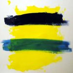
These characteristics might not make themselves immediately apparent if you paint in an impasto, heavy way. For example, this Archival Oils Pthalo Blue is labeled “transparent. But when I apply it at full strength, with just a bit of lean medium to help the paint flow, it still looks pretty dark on this swatch of Arylamide Yellow Light. But if I add a bit more medium, and brush it out a bit – wow. The undertone clearly shows how beautifully transparent this color is. Instead of physically mixing this Pthalo Blue with Arylamide Yellow Light to create green, this transparent color on top optically mixes with the underlying yellow to create green.
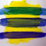
As you can see, when you glaze, scumble or apply layers of colors on top of one another, knowing the inherit transparency of a color will help you make good painting choices. Let’s say I want to glaze. In this example, I again have a swatch of Arylamide Yellow Light, but this one has been painted with Atelier Interactive. I have three colors here – Pthalo Blue (transparent), French Ultramarine Blue (semi-transparent), and Pacific Blue (opaque). I’m going to mix up 3 glazes using the Clear Painting Medium, in a ratio of about 90% medium to 10% paint, and then apply each.
See the difference? The Pthalo Blue, the transparent paint, made a great glaze. The French Ultramarine Blue glaze is semi-transparent, but the Pacific Blue is not that good. It covers too much of my underlying color.
However, if I wanted to create an underpainting, cover up part of my painting, or even my surface, then choosing to use an opaque color like Pacific Blue would be a good choice. If I chose a transparent color, than I would have to use a lot of it to get good opacity. This is particularly true for lighter colors, such as yellow.
Personally, I like to have a mix of opaque, semi-transparent and transparent colors on my palette, because it provides me with a range of options. Some of my standard colors include:
- Titanium White (opaque)
- Cadmium Yellow Light (opaque)
- Cadmium Yellow Medium (opaque)
- Crimson (semi-transparent)
- Quinacridone Magenta (transparent)
- Cobalt Blue (semi-transparent)
- Cerulean Blue (semi-transparent)
- Dioxazine Purple (transparent)
So next time you’re ready to use some Archival Oils or Atelier Interactive, take the time to look at the tube – you may be surprised by what you learn!


