With spring just around the corner here in the USA, I thought it was a good time to address the subject of “green” in regards to colors. As a landscape painter, it is easy to get overwhelmed by the amount of greens out there. But with careful observation, and a few general guidelines, it’s easy to get the green you need.
As you probably remember from early painting days, blue and yellow, when mixed, make green. However, what green you get will depend on what blue and what yellow you use. Pigments are what gives paint its color, and each pigment has its own particular tendency towards being “warm” or “cool.” You can determine what pigments are used in Archival Oils or Atelier Interactive be looking at the back of the tube, or on a color chart. The pigments are denoted by a standard code: PY. # (yellow pigments), PB. # (blue pigments), etc. Each number stands for an individual pigment. Some yellow and blue pigments (and therefore paint color) have a bias towards red or orange, leaning towards the warm side of the color wheel. Other yellow or blue pigments have a bias towards the cooler side of the color wheel, and lean towards green or violet.
So what does this mean? In practical terms, it means that if you choose a warm blue and a warm yellow, you will get a warm green. If you choose a cool blue and a cool yellow, you will get a cool green. But if you mix a warm blue and a cool yellow, or a cool blue and a warm yellow, you will get a duller, muddier green.
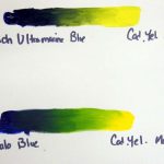
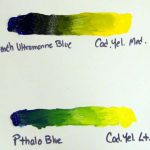
For example, French Ultramarine Blue is a warm blue, Cadmium Yellow Medium is a warm yellow, Pthalo Blue is a cool blue, and Cadmium Yellow Light is a cool yellow. When I physically mix French Ultramarine Blue and Cadmium Yellow Medium, I get a range of warm greens. Mixing Pthalo Blue and Cadmium Yellow Light gives me a range of cool greens. When I mix French Ultramarine Blue and Cadmium Yellow Light, I get green but it is duller and not as intense, because I am mixing a warm and cool color. By looking carefully at your subject, and determining its color temperature, you can figure out what colors to use.
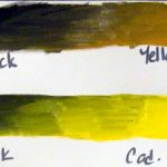
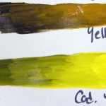
You can also get a wonderful range of earth greens by mixing black and any yellow. Yellow Ochre and Carbon Black or Mars Black create muted greens often found in nature. If you create a mixed green that is too punchy, try adding a bit of its compliment to tone it down.
And don’t forget about using a convenience color! Although mixing your own greens is a good way to achieve color harmony and to learn your palette, Archival Oils and Atelier Interactive offer a wide range of greens, including Permanent Green Light, Permanent Sap Green, Olive Green, Cobalt Green, Cobalt Green Hue, Forest Green, Chromium Green Oxide, Terre Verte and Pthalo Green. There is also Green Black, a beautiful toned black. These greens can be a great starting point, and can be modulated by adding yellow or blue.
So this spring, experiment with mixing your own greens, or try a new tube of green. Be sure to post your results here – we’d love to see your work!