Happy, tiny cherubs. Lovely, precious, little darlings. Squirming, crying, drooling, non-stop bouncing, running, laughing bundles of energy. All of these descriptions are applicable to children, especially to those between the ages of 10 months and 4 years, and it seems, especially to my children. But it doesn’t mean I can’t paint them, it just means I need to be ready for those rare quiet moments. Personally, I’ve found that after feeding time or when they are engaged in activity are the best times to take photos or do sketches. My goal is not to get the perfect pose, but rather to get the personality, to capture a specific physical feature, or even to document the light and color of a time of day.
Such was the case with Sunflower (For E) , a companion piece to Sonshine (For R) . After lots of photos and sketches, I felt ready to begin. Rather than doing a 7-Layer Flemish technique using Atelier Interactive, Professional Artists’ Acrylics as I did in Sonshine , I made some modifications to this portrait. I still painted with Atelier Interactive, but I changed my color palette, surface and approach.
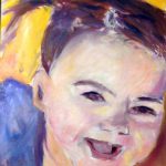
I began by creating a cartoon to scale, and transferred it to my surface (Ampersand Pastel Panel). This surface is fairly absorbent, which aided my goal of a looser piece. I painted value washes using Mars Violet and Titanium White. I paid particular attention to the edges and transitions, in order to achieve the roundness of her face. Because children lack the bone structure of adults, it was important to use my water sprayer when I felt my paint start to tack up to keep blending. In this composition, the child’s hair is a striking feature, and I knew it would require many layers and colors, so I merely blocked in the darkest value. (Fig. 1)
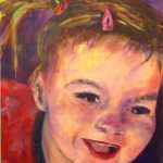
Once I was happy with this stage, I decided to forgo a traditional dead layer but used a modified impressionist palette of Cadmium Yellow Light, Cadmium Yellow Medium Cadmium Yellow Deep, Jaune Brillant, Transparent Perinone Orange, Napthol Red Light, Quinacridone Magenta, Permanent Alizarine, French Ultramarine Blue, Pthalo Blue (Red Shade) and Dioxizine Purple to block in and develop the shapes more fully. Note that I used the word “shape.” I find it is very important not think in terms of “painting a person” but “painting the shapes/lights/darks.” I personally can get too caught up in details, wrapped up in capturing the likeness Instead, when I think in terms of shapes, shadows and masses (like I do with landscapes or other subject matter) it all comes together for me. A classic example of this approach can be seen in Sargent’s Carnation, Lily. Lily Rose – one of my all time favorite paintings.
I used the warmer colors for the light masses, and cooler ones for my dark masses, for my first color pass. Because this painting had lots of sunny yellow tones, using Mars Violet as my underpainting color created complementary color reactions. I used Clear Painting Medium to thin my paint to have just enough transparency in order to let the value layer influence the colors on top and to keep track of the likeness. If I needed to gray a color, I added a bit of its opposite – I rarely use black or dark earth tones. I kept my water sprayer handy and sprayed whenever I was blending and my paint felt tacky. If I didn’t want to blend, I withheld moisture, let that section dry, and then painted on top. That’s how easy – and versatile – painting with Atelier Interactive is! (Fig 2.)
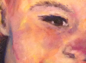
I made a few more color passes in order to build up the abstract, tactile side of the painting. I chose paint as my medium because I like the physicality of paint, after all! I let these layers dry overnight and applied glazes next. These were made made with Clear Painting Medium and various mixtures of Transparent Perinone Orange, Permanent Alizarine, Pthalo Blue (Red Shade) and Dioxazine Purple, in order to capture lost shadows. I also incorporated some Tinting White (Pearl Titanium) to tone down some sections. These glazes were applied with my favorite sable glazing brush! I also adjusted some edges to keep a modeled, rounded form on her face. I used Unlocking Formula on her hair, and scratched in some individual strands and texture. (Fig. 3)
This study shows the power of combining oil-like wet-in-wet blending with traditional acrylic glazing and overpainting techniques when painting with Atelier Interactive. By using a combination of techniques, I created a portrait that captured the freshness, the energy and the joy of the subject.There are many approaches to painting figures and portraits; by not limiting yourself to only a few techniques, staying within the rigid confines of a style or even a given medium, you can explore a wide range of possibilities for artistic expression.